Financial markets went on a fairly wild ride last week as downbeat manufacturing data combined…
Housing Market Weakness Depends on Perspective
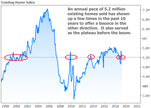
This week’s biggest housing-related headline was the drop to a 3-year low in Existing Home Sales. This is just the latest in a series of reports that suggests housing has turned some sort of scary corner. But drawing the line between fear and reality can be a matter of perspective.
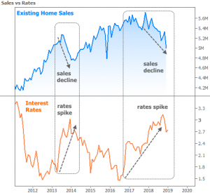
Has housing data actually weakened in the past year? Undoubtedly! There’s really no denying or debating that fact. But home sales dropped in a similar way in 2013 after the last comparable spike in interest rates only to go on to new long-term highs by the middle of 2015.
We can’t really know if housing will recover in a similar way this time, and that’s exactly the point! Nothing we’ve seen so far is much of a surprise in the context of the interest rate spike. In fact, if anything, the surprise is how well housing continued to do after the first phase of the rate spike in late 2016. It wasn’t until the 2nd phase in 2018 that sales finally capitulated.
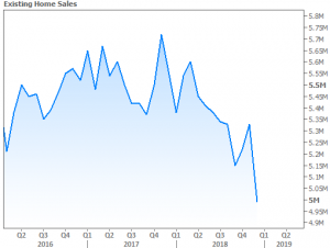
Now forget the interest rate considerations above and simply focus on perspective and context. Just by changing the time period on the chart, we can paint vastly different pictures. The most downbeat pictures are those that compare current levels to the long-term highs seen in 2017.
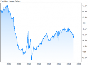
Things change as we zoom out to wider points of view. This could still look a bit gloomy depending on your perspective, but much less so than the previous chart:
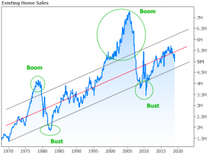
If we continue to zoom out, the longer-term trend emerges. In this chart, it’s actually easier to make a case for housing market strength. The red line is a simple linear regression from before the 2000’s housing boom. When sales are under that line, it signifies opportunity to improve. Additionally, it’s reassuring to see that sales are not currently falling from one of their boom cycles (those have been the worst times for the housing market).
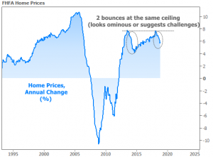
Perspective can have an impact on our assessment when it comes to home prices as well. The latest home price report from the FHFA (Fannie and Freddie’s regulator) was also released this week. Home prices are commonly reported in terms of year-over-year change. This is a useful practice as it allows us to see changes in trends more easily. Here too, we see the ill effects of the 2013 and 2018 rate spikes as well as a potentially ominous ceiling blocking further progress.
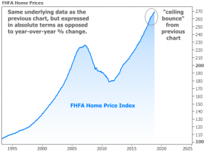
But let’s ask ourselves if we’d really want home prices to accelerate faster and faster when they’ve already spent several years in the 5-7% range. That doesn’t sound sustainable in an economy where wage growth only recently made it back to 3%. Perhaps more importantly, let’s ask ourselves why a drop in the pace of appreciation is a bad thing if prices are still moving up. For instance, here’s what the same data looks like when we chart the outright level of FHFA’s home price index.
The point of all this is to reiterate that different cases can be made simply by using different techniques to present the exact same data.
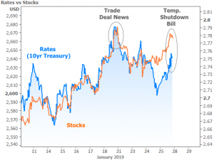
In financial markets, stocks and bonds/rates spent the first part of the week moving lower before bouncing on Friday as odds improved for a temporary re-opening of the government. The temporary nature of the solution likely accounts for the absence of a bigger market reaction. Neither stocks nor bonds were willing to move back to the levels seen after last week’s trade-related news.
Next week brings two key events that were on the schedule regardless of the shutdown. The Federal Reserve will release an updated policy statement on Wednesday afternoon. They won’t be raising rates at this meeting. In fact, many investors think we’ll see the Fed strike a softer tone compared to December’s announcement. Such things are usually good for rates, but if investors were in broad agreement about that likelihood, rates would have already benefited from those expectations.
Then on Friday, we’ll get the next installment of the government’s official jobs report–always one of the biggest potential sources of volatility for interest rates. As of Friday afternoon, the government hasn’t announced a tentative schedule for releasing any of the data that had been on hold during the shutdown.
© 2019 MBS Live, Inc. 19701 Bethel Church Rd Suite 103-225 – Cornelius, NC 28031. All rights reserved.

